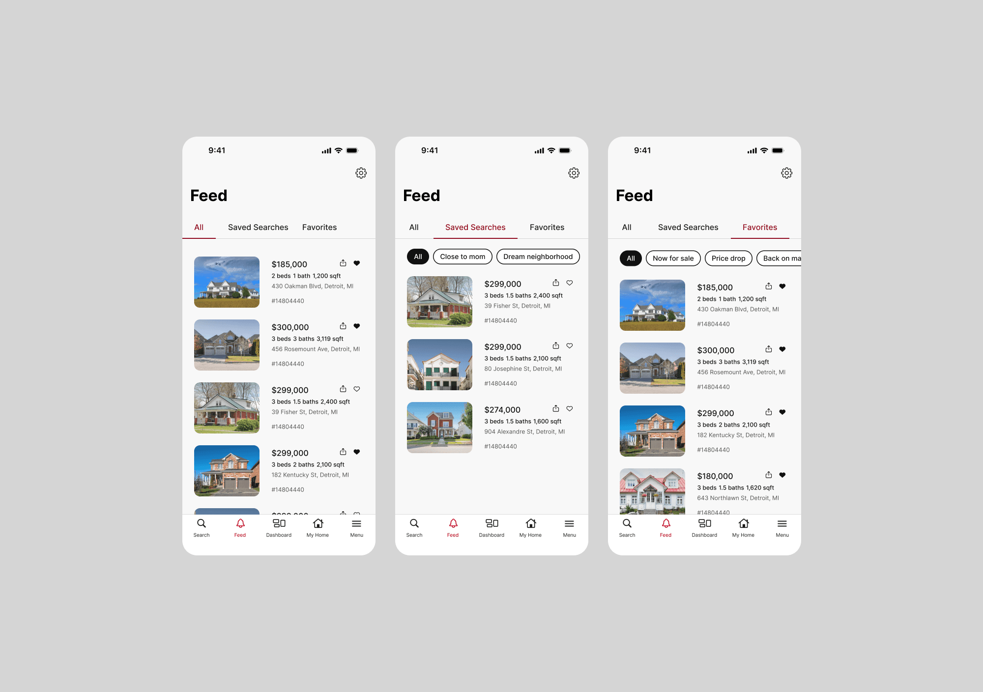
UX case study: Saved tab

UX case study:
Saved tab

Overview

The "Saved" tab on the Rocket app was designed to be a place for users to manage all of their saved searches and receive updates on their saved homes. Metrics revealed that the experience was underperforming and research showed that it wasn't meeting user needs. The saved tab was prominent on the app and highly valuable for the business because users who actively set up saved searches and saved homes showed higher purchase intent, which ultimately converted into higher agent leads. However, despite the strategic importance, the experience was confusing and underwhelming.

Additionally, the existing design lacked responsive functionality, creating a sub-par experience on larger screens. This became particularly urgent as we were preparing at the time to launch an Apple Vision Pro and TV app, and this would significantly impact the user experience. The integration with Apple was part of a larger marketing and product strategy which was expected to result in a high volume of app downloads and new user account creations.

As lead designer, I reimagined the entire experience with intuitive organization, streamlined navigation, and platform-agnostic responsive design that delivered seamless experiences across all devices. This strategic overhaul eliminated user friction while generating compelling business results, including significant improvements in engagement metrics and a meaningful lift in agent connections.

The "Saved" tab on the Rocket app was designed to be a place for users to manage all of their saved searches and receive updates on their saved homes.

Metrics revealed that the experience was underperforming and research showed that it wasn't meeting user needs. The saved tab was prominent on the app and highly valuable for the business because users who actively set up saved searches and saved homes showed higher purchase intent, which ultimately converted into higher agent leads. However, despite the strategic importance, the experience was confusing and underwhelming.

Additionally, the existing design lacked responsive functionality, creating a sub-par experience on larger screens. This became particularly urgent as we were preparing at the time to launch an Apple Vision Pro and TV app, and this would significantly impact the user experience. The integration with Apple was part of a larger marketing and product strategy which was expected to result in a high volume of app downloads and new user account creations.

Business impact

This feature directly supported lead conversion by keeping engaged users within Rocket's ecosystem. Users who set up saved searches and saved homes demonstrated higher purchase intent and were more likely to request agent services.

We hypothesized that the inability to easily navigate saved searches and homes was causing potential leads to abandon their search or seek alternatives, directly impacting Rocket's market share in the competitive online real estate space and that by improving the user experience we would see increased session duration and repeat visits (both strong indicators of purchase intent) and ultimately more connections to agents.

Objectives
  • Streamline the saved tab experience to empower users to more effectively engage with their saved searches and saved homes.

  • Improve the visual hierarchy to create a more intuitive experience that better aligns with user expectations.

  • Redesign the experience to be fully responsive across all supported devices and screen sizes.

  • Increase session duration, repeat visits and connections to agents.

Design process

Through both qualitative and quantitative analysis, I identified key friction points in the user journey.

I reviewed research reports and user interviews to understand pain points and then collaborated with the research team to identify these key user problems:

  • Users did not understand the distinction between saved searches and favorite updates, often confusing the two.

  • The “All” tab and “All” filter chip caused further confusion because users often assumed they were the same, leading to misunderstandings about the content being shown.

  • Custom saved search names weren’t enough to help users recall what filters they had applied, making it difficult to differentiate between them.

  • Users wanted an easier way to see all saved homes on a map (without having to open listings one by one) to save time by quickly identifying which homes were of interest.

  • Users were frustrated that they had to navigate through all of the favorite update categories to find out if there were relevant updates.

Designs (before)

Through both qualitative and quantitative analysis, I identified key friction points in the user journey.

I reviewed research reports and user interviews to understand pain points and then collaborated with the research team to identify these key user problems:

  • Users did not understand the distinction between Saved Searches and Favorite updates, often confusing the two.

  • The “All” tab and “All” filter chip caused further confusion because users often assumed they were the same, leading to misunderstandings about the content being shown.

  • Custom saved search names weren’t enough to help users recall what filters they had applied, making it difficult to differentiate between them.

  • Users wanted an easier way to see all saved homes on a map (without having to open listings one by one) to save time by quickly identifying which homes were of interest.

  • Users were frustrated that they had to navigate through all of the Favorite update categories to find out if there were relevant updates.

Designs (before)
Baseline metrics
  • Users who set up at least 1 saved search and saved 3+ homes were 4x more likely to connect with an agent.

  • Time spent on saved tab for authenticated users: 1.2 minutes average per visit.

  • Repeat visits to saved tab for authenticated users: 2.0 visits per week.

Process

We took an iterative approach and decided to start testing in phases instead of everything all at once. This allowed us to work in an agile way, and we could incorporate user feedback as we went along. Our initial priority was identifying the root cause of user confusion surrounding saved searches and favorite updates. Once we had refined several design concepts, we conducted an unmoderated usability study presenting users with static mockups of design variations, accompanied by targeted questions. The research team's subsequent analysis provided actionable insights that gave us confidence to proceed with our chosen design direction.

We took an iterative approach and decided to start testing in phases instead of everything all at once. This allowed us to work in an agile way, and we could incorporate user feedback as we went along.

Our initial priority was to identify the root cause of user confusion surrounding saved searches and favorite updates. Once we had refined several design concepts, we conducted an unmoderated usability study presenting users with static mockups of design variations, accompanied by targeted questions. The research team's subsequent analysis provided actionable insights that gave us confidence to proceed with our chosen design direction.

Solution

With a promising solution identified, we developed a functional prototype for testing which included key additions:

  • Introduced visual tags to saved home updates to highlight key status changes.

  • Added a map view toggle so users can easily see all of their saved homes geographically.

  • Enabled users to view and edit saved search filters directly from the tab, streamlining what was previously a convoluted process.

  • Displayed a summary of filters applied to each saved search, helping users recall what each one represented.

  • Ensured the new design scaled smoothly across all devices.

  • Changed "Favorite updates" to "Saved homes"

User research
  • Conducted a two-part moderated usability study of the redesigned experience with 12 participants; 6 iOS users and 6 Android users all of whom had accounts with real estate platforms.

  • For part one, users were asked to create an account with Rocket, set up a few Saved Searches and save at least 12 homes. They then used the app naturally over the course of a month.

  • In part two, we conducted one-on-one interviews to gather in-depth feedback based on their real-world use.


Key Findings:

  • Clarity Achieved: This marked the first time in Rocket's user testing history that 100% of participants clearly understood the difference between Saved Searches and Saved Homes.

  • Feature Discoverability: The map view toggle and Saved Searches edit functionality proved intuitive, with all users locating and using these features effortlessly.

  • Positive Feedback: Users applauded both the clarity of the search filters and the helpful confirmation feedback provided throughout the editing experience.

  • Saved home updates stood out: Many users noted that they had never encountered categorized updates like these on other platforms, finding features such as Price Drop, Sale Pending, and Back on Market particularly valuable.

Results and impact
Results and impact
The redesigned Saved tab successfully addressed the core friction points identified in our research, creating a more intuitive and actionable experience for high-intent users. Key improvements included enhanced organization capabilities, streamlined navigation, and responsive design that performed seamlessly across all platforms, including our newly launched Apple Vision Pro and TV applications.

Post-launch metrics showed:

  • Agent connection rate improved - The 4x likelihood multiplier increased to 5.2x for users with at least 1 saved search and 3+ saved homes, demonstrating enhanced conversion from high-intent users.

  • Session duration increased by 67% - Average time on Saved tab rose from 1.2 to 2.0 minutes for authenticated users.

  • Repeat visits improved by 50% - Weekly visits to Saved tab increased from 2.0 to 3.0 visits per week.

Building on our testing results, we implemented additional enhancements, including AI integration:

Building on our testing results, we implemented additional enhancements, including AI integration:

  • Implemented a carousel of "Homes for you" using AI-driven recommendations that considered user preferences alongside behavioral signals like browsing patterns, location data, and saving history.

  • Improved our empty state screens and added calls to action.

  • Added connect with agent cards when no results were found.

Challenges

While iterating, I discovered that our backend didn’t support hiding empty saved home status update categories, forcing us to display “You’re all caught up” even when no updates existed. I collaborated closely with our data team to fix this limitation, ultimately enabling a cleaner experience where only relevant categories were shown and empty categories hidden.

Determining optimal number of recommendations, card layout, and interaction patterns for different screen sizes was challenging because we had to ensure that designs looked and performed well across all devices. It was truly a collaborative effort across product, technology and design to achieve great results.

Future opportunities

Our research and initial implementation revealed several promising directions we had identified for continued optimization:

Improved Tags - We had planned to implement smart tags that would reflect individual priorities such as "Most Affordable," "Top-Rated Schools," or "Shortest Commute," automatically applied based on search patterns and stated preferences. We were also actively developing an "Open House" tag feature to help users track time-sensitive opportunities.

Proactive Recommendations - Future iterations would have leveraged user data to provide intelligent suggestions, including affordability-matched alternatives when users saved properties outside their budget range, and nearby options that met their core criteria. The system was designed to learn from filter usage, location preferences, and importance rankings for factors like school districts and commute times.

Enhanced Comparison Tools - User feedback indicated strong demand for side-by-side property comparison functionality, which we had prioritized for development to allow users to evaluate multiple saved homes across key metrics simultaneously.

Dynamic Interface Evolution - We had begun exploring adaptive UI patterns where saved properties would display enhanced information and actions, creating a more purposeful distinction between browsing and saving modes.

Intelligent Personalization - We implemented AI-driven recommendations that considered user preferences alongside behavioral signals like browsing patterns, location data, and saving history. While we achieved our core objectives, the robust foundation we built revealed exciting possibilities for advanced personalization features that we had identified as the next strategic priority.

Challenges

While iterating, I discovered that our backend didn’t support hiding empty Saved home status update categories, forcing us to display “You’re All Caught Up” even when no updates existed. I collaborated closely with our data team to fix this limitation, ultimately enabling a cleaner experience where only relevant categories were shown and empty categories hidden.

Determining optimal number of recommendations, card layout, and interaction patterns for different screen sizes was challenging because we had to ensure that designs looked and performed well across all devices. It was truly a collaborative effort across product, technology and design to achieve great results.

Conclusion

This redesign transformed the Saved tab, from an under-utilized feature into a strategic conversion tool that effectively nurtured our high purchase intent users. The thoughtful infrastructure we established supported advanced personalization that responded intelligently to user behaviors while preserving the intuitive, streamlined experience that drove measurable results. Unfortunately the Rocket app (add this feature) no longer exist so we were unable to implement the future opportunities identified above.